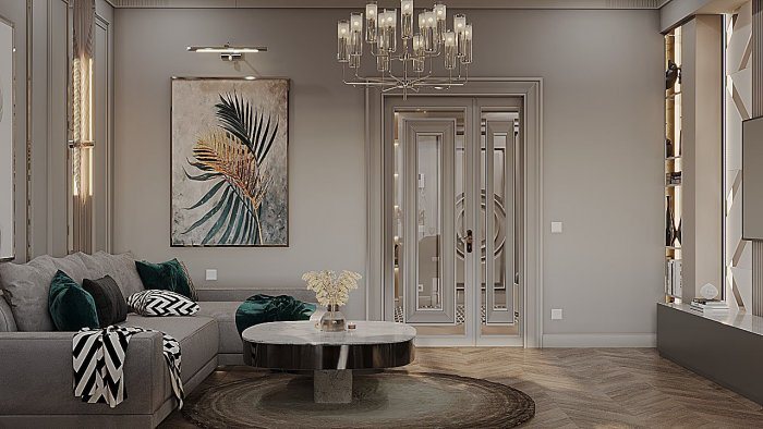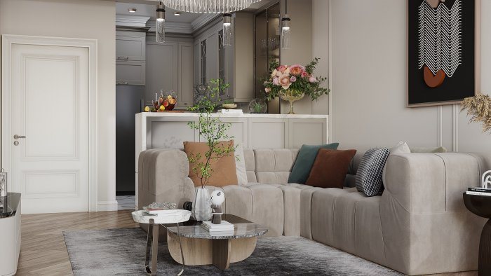

Choosing an Interior Colour Palette: Base, Secondary, Accent
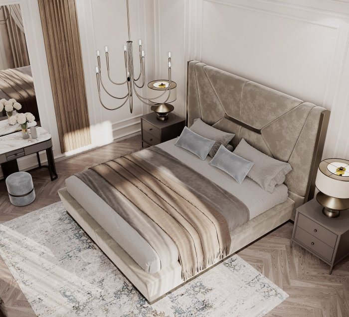
A colour palette is built from the balance of base, secondary and accent colours. When light, materials and flow between rooms are considered, the interior looks coherent.
Colour is the cheapest element of an interior to change, yet it has the strongest effect. The same layout and the same furniture create a completely different mood with a different palette. The difficulty is that when colours are picked one at a time from a fan deck or a screen, it is hard to imagine how they will look together. Building the palette systematically prevents accidental clashes.
The three layers of a palette
Professionally, colours are divided by their role:
- base colour: most of the walls, the ceiling and sometimes the floor; it creates the background;
- secondary colour: large furniture, curtains, kitchen fronts, part of a wall; it supports the background and adds depth;
- accent colour: cushions, a lamp, an armchair, artwork, decorative objects; it draws attention to a specific point.
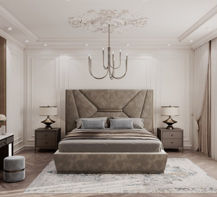
The often-quoted 60-30-10 rule gives an approximate ratio for these roles: about 60 percent of the area in the base colour, 30 percent in the secondary and 10 percent in the accent. It is not a strict mathematical requirement but a reference to keep balance in mind. Its value is that it keeps the accent colour an actual accent.
Choosing the base colour
The base colour is the most visible and the longest-lasting, so it should be calm and versatile. Light beige, warm white, pale grey, sand or olive-tinged neutrals work with a wide range of furniture and materials.
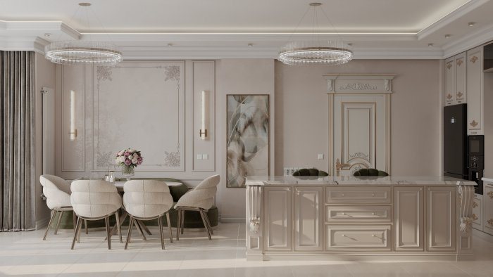
Pay attention to the colour's undertone. The same grey can lean yellow, pink or blue. A warm-undertone grey works with a wooden floor and beige marble, while a cool grey next to them may look dirty. The most reliable method is to place the paint sample next to a flooring or tile sample.
Secondary and accent colours
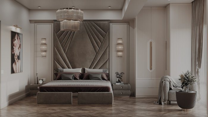
The secondary colour can come from the same family as the base (for example, a deeper brown version of pale beige) or from a neighbouring part of the colour wheel. This creates a calm, harmonious interior. For a livelier result the secondary colour contrasts with the base — deep blue furniture on a pale grey background, for instance.
The accent colour takes the most courage, but it is also the easiest to change. An accent introduced through textiles and décor can be refreshed in a few years. An accent in wall paint or tiles lasts longer, so it should be based on personal taste rather than trends.
Light changes colour
The same paint looks different in north- and south-facing rooms. North-facing rooms get cool, weaker light, so warm-undertone colours make them more comfortable. In south- and west-facing rooms strong sunlight washes out and warms colours, and cooler tones can restore the balance.
Artificial light plays its part too. Warm lamps deepen blues and greens, while cool light makes beige and red tones look paler. A palette should be checked in both daylight and evening light.
Material also changes how colour is perceived: the same tone looks soft on a matt wall but darker and more saturated on a gloss cabinet front. On fabric, colour folds with the texture; on stone and wood it mixes with the natural pattern.
Flow between rooms
An apartment should be thought of as one palette. When each room has its own separate colour world, walking from door to door makes the space feel fragmented. A practical approach is to keep a common base colour (or close shades of it) throughout the flat and vary the secondary and accent colours according to each room's function.
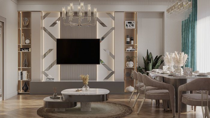
In open-plan areas this is especially important: the kitchen, dining and living zones are seen at a glance, so their colours need to speak to each other.
Steps to test a palette
- choose colours from a physical fan deck or painted board, not from a screen;
- paint large test patches in several places on the wall, near and far from the window;
- put samples side by side with flooring, tile and furniture materials;
- check the decision in daylight, in the evening and under artificial light;
- review the overall look in a visualisation with the chosen colours, but make the final decision on real samples.
In design projects Zaferoğlu İnşaat selects material combinations and colour ranges together with the client and presents the solutions in sketches and computer models. The palette can be assessed together with the real dimensions and lighting of the rooms.
News