
Branding in Commercial Interiors: Colour, Signage, Materials
How to express a brand in a café, shop or salon without stamping the logo everywhere: colour palette, signage and lettering, materials and light.
In the brand guidelines everything is clear: logo, colour codes, typeface. But translating those rules into a real space raises questions. Should every wall be painted in the corporate red? How many times should the logo appear? Which material expresses a brand that wants to feel “warm and friendly”? In a commercial interior, a brand is not a simple repetition of graphic elements; it is the overall experience a guest has in the space.
Translating a brand into spatial language
In graphic design a brand works on small surfaces: business cards, packaging, screens. In a space, the same elements grow many times over, and people may spend hours surrounded by them. A bright colour that looks appealing on screen can become tiring on a large wall, and a delicate typeface can be unreadable from a distance.
It helps to start by defining the brand’s character. How does it present itself: premium and calm, young and energetic, family-oriented and warm, technological and minimal? That character then becomes the balance of colours, the choice of materials, the lighting scheme and even the shapes of furniture. The logo is only one part of this system.
Colour: proportion matters
The most common mistake in bringing corporate colours into an interior is using them equally and everywhere. A more effective approach is to give colours roles:
- base: neutral or quiet tones close to the brand, covering most of the space;
- secondary colour: mid-sized areas such as furniture, cladding or a single wall;
- accent: the brightest version of the corporate colour, used where you want to draw attention — in front of the counter, behind the till or at the entrance portal.
Corporate colours are defined for print and screen, and may look different in materials such as paint, tiles, fabric or laminate. The closest material match to the brand colour should be selected using physical samples under real lighting. The same colour also reads differently on matt and glossy surfaces.
Lettering, signage and wayfinding
Text in a space does three jobs: it identifies the brand, shows the way and gives information. Each needs its own place and scale.
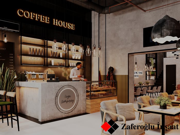
The facade sign and entrance lettering are the brand’s first introduction and must be readable from a distance. Their size, illumination and fixing need to be coordinated with building rules and local requirements. Inside, showing the logo at one or two strong points — behind the reception desk or on a wall where people take photos — is more effective than repeating it on every surface.
Wayfinding elements such as menu boards, opening hours, toilet and exit signs are made in a consistent style using a legible version of the brand typeface. If the brand font is decorative, a simpler companion font can be chosen for longer text and signs. Contrast and letter size should let guests read information quickly and from a distance.
Materials are the tangible side of a brand
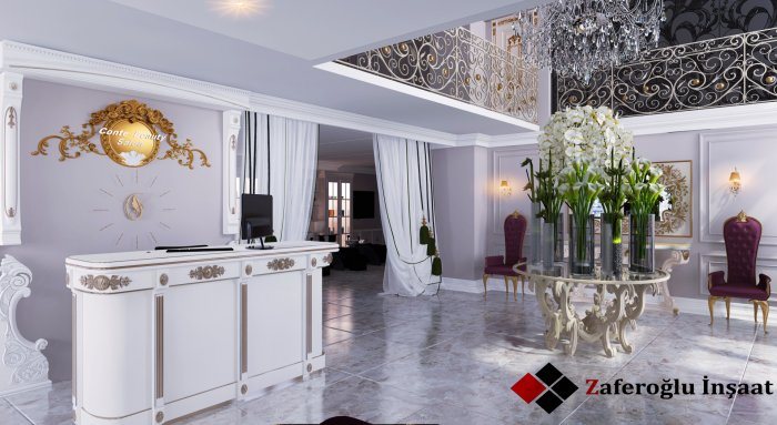
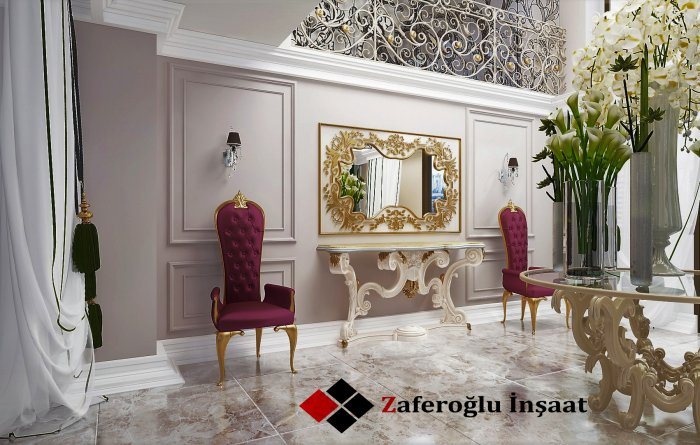
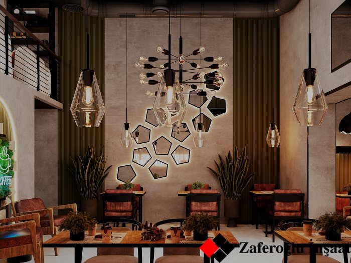
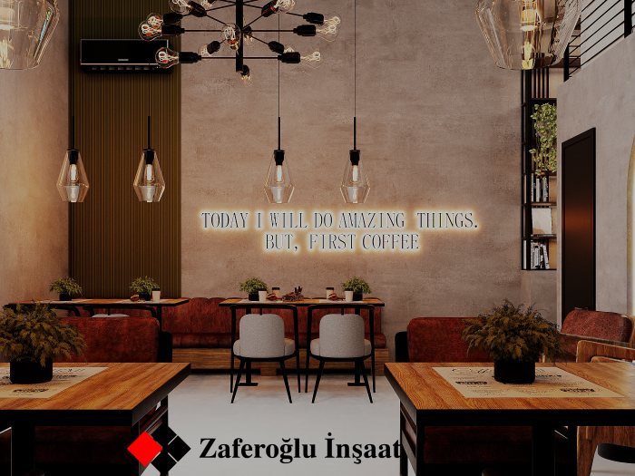
Colour and logo are seen; materials are both seen and felt. Natural timber, warm textiles and matt surfaces support a friendly, home-like brand. Metal, glass, concrete and precise lines reinforce a technological, contemporary image. Marble or stone, velvet and fine metal details create a premium impression.
Material choice is not only about image. In a commercial space, surfaces face heavy daily use, frequent cleaning and knocks. A material that fits the brand but looks worn within a few months actually harms the brand. That is why each material’s durability and maintenance needs should be assessed alongside its image.
Light, sound and repeatability
The brand experience is completed by light. Colour temperature, brightness and accent points can make the same palette look entirely different: warm light enhances timber and textiles, while cool light sharpens metal and white surfaces. Background music and acoustics are part of the experience too and should be considered together with the interior design.
If the brand will have several branches, the interior solution should be built as a repeatable system. Each new site may differ in size and shape, but colour roles, the material set, signage types and lighting principles stay constant. Documenting this system as written rules and typical drawings saves time on future projects and protects brand recognition.
Zaferoğlu İnşaat renovates offices and food-service venues, helps choose material combinations and colour palettes, and presents solutions in sketches and computer models. If you have a brand book, bring it in from day one so we can test on a sketch which surfaces should carry your colours.
News